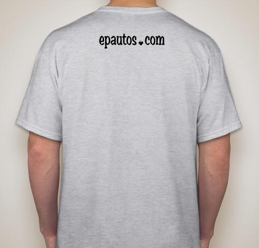
Hey guys, we’re thinking about making t-shirts again. I’ve been messing around on the Custom Ink website and came up with a simple design.


We’re thinking about purchasing 25 of them to start. Is this something you all would be interested in? I made the “dot” as an upside down clover. I think its simple and looks pretty cool. We’d sell them for $23 shipped at first, because small orders are more expensive. Input, suggestions, ideas, or even other designs welcome! The Custom Ink website is pretty cool and has an excellent design tool that’s super easy to use.


Consider the KISS concept.
I like the black with white lettering. It stands out much better than the red.
Consider the phrase “Throw it in the Woods” to be over where the left breast pocket would be. On the back, use the name of the website and forest logo. But, for design purposes, consider moving it down where a standard logo would be placed. Where the logo is now would be covered up by those of us who haven’t visited a barber/hair stylist in years.
.02 worth…
Personally, I love the red – but I’d note that it looks similar to a bloody mess from a short distance. Like blood dripping down the front. 😉
Stick with white trees, at least.
It DOES look like dripping blood, Jean! LOL
Red lettering?
Red
I’m really digging the white with the woods!
What size is everyone?
The red looks a little bit evil with those trees.
The shirt needed something, the trees seem to fit.
Scrolling back up, the white on black looks better, surprisingly.
LT.
Project Runway…check. Don’t forget the Cruel Shoes.
If I was gonna sell a T-shirt, it would be a heavyweight pocket T. ‘Course, as to T shirt colors, it’s like this: There’s two T shirt colors. You got your BLACK, then you got all that other shit that looks gay.
Just my $2 worth on the subject.
“You got your BLACK, then you got all that other shit that looks gay.”
Oh mang, that hurt! I have a few black T-shirts, but I don’t wear them because they are too hot when I’m out in the sun. I figured ash gray was a cool neutral color that would match a lot and not be too hot. I thought about black with white writing, which is cool and loud. Let me look again.
It does look clean!
Dear Ed,
“You got your BLACK, then you got all that other shit that looks gay.”
LOL.
Actually, even black looks “gay” if it also has sequins on it.
Nothing looks “gay” if done in good taste…. (snark alert)
Dear MoT,
Okay. Black with sequins it is then.
Next stop, “Project Runway.”
Yeah, so leave off the sequins and you got yourself a T shirt. 😉
I tried making some sequins out of clovers, but got side tracked.
Dear dom,
Selling stuff is an excellent idea.
Nothing wrong with it at all. It is actually the way anything worth having should be sustained.
Not “crass.” The idea that selling stuff is “crass” is a leftist one. It’s “unearned guilt.” Rand exposed that guilt-trip for what it was long ago.
After all, aren’t we capitalists? I mean, anarcho-capitalists are still capitalists aren’t they?
Of course that still leaves the question of what would people actually want to buy. That’s the hard part.
Yeah, I want to keep the first shirt simple and cool. Something I can wear to work on casual Friday! Gnomesayin’
Just one nit to pick: the location of “Throw it in the Woods” seems to imply that the website should be thrown in the woods. I would be interested in seeing something like “Statism: X-hundred million murdered and counting” on the front and “Statism: Throw it in the Woods” on the back with “epautos.com” under it. I am more in-your-face with my freedom loving than many so my idea may not do as much good as harm. It certainly would get folks talking, though. Other than that, it’s a decent shirt, Dom. I think I could purchase one for the cause.
Of course X would be filled in with the current number of hundreds of millions dead by democide.
I’ll do one the way you mentioned and post it here, so we can all see. Doh, I just read your entire post! I usually only skim..
This just looks off balance I think.
I don’t know. What do you think? Might not be bad.
Not really. If I knew nothing about either “Throw it in the Woods” or “epautos.com,” this setup would lead me to ask what “Throw it in the Woods” means and whether I could find the answer on epautos.com. Even better, I would search the website for the answer myself without asking the wearer and find a wealth of liberty-minded information in the process. I know I was searching for information on my birth year back when I was a sophmoric statist and was lead down the deepest rabbit hole of libertarianism one has ever known (I was born in 1984).
Trick their curiosity Dom. Integrate a peace symbol and the μολὼν λαβέ molṑn labé; crossed rifles in the graphic.
Can’t do any rifles mang. I tried making the clover green, but that adds like $3 to the price of the shirt!
Reserve that for the “limited Edition” jacket.
Ok no rifles. How about the “300” helmet version. Just musi’n. Make me want to go see what that .com is.
It’s okayy.
I’m not so keen on the black on gray, but it’s not objectionable.
The clover dot is smooth.
Seems like it needs flames or something somewhere.
Maybe on the back: Automobiles, Motorcycles and Libertarian Politics ?
Maybe have it half-way down the back?
Then again, if it had the word, ‘politics’ on it, it might scare people?
I dunno, just free-thinking a bit.
I’d buy one.
“Then again, if it had the word, ‘politics’ on it, it might scare people?”
Yep, thought the exact same thing.
I like that. I would get one. Eventually, maybe years, I would Ike to see a more in your face one about “heroes.”
I like this one to start us out. Good stuff!